Mindful appMental health resources app
Duration
Feb-Apr 2023
Role
UX Designer
Challenge
People who are working on their mental health want easy-to-follow, reliable, and accessible resources to help them continue their journey
Goal
Design an app that allows users to strengthen their mental health journey by searching for resources customized to their needs
Empathize
Summary
I conducted interviews to understand the needs and frustrations of the users but also the type of resources they like to consume and what has been most helpful for them. Based on the information of the empathy maps and insights found, one of the groups where using and searching for resources when they were facing an anxiety crisis, all of them used different apps and resources for music, guided meditation, etc. The second group showed more interest in learning about what they have already identified in therapy, for example, learning their triggers based on their childhood trauma.
Pain points
1. Content
It’s difficult to find reliable content fact-checked by actual professionals
2. Money
Specific content can be very expensive and people are fearful to pay for scam content
3. Accessibility
Content can be very overwhelming and not designed for neurodivergent people
Persona 1: Alberto
Age: 24
Education: Undergraduate
Hometown: San Jose
Family: Lives with sister
Occupation: IT Solutions Advisor
“The resource that had helped me the most it’s the one that it’s called sleep cast, auditives experiences like stories”
Alberto is a 24-year-old IT Advisor, that has been dealing with anxiety since the pandemic and finds it helpful to use mindfulness apps, calming music, and guided respiration exercises during a crisis. They feel that the experience can be improved by expert advice and guidance
Goals
To use an app to help during anxiety crisis to soothe the brain
Find easy-to-follow resources (ADHD-friendly)
Frustrations
“I feel overwhelmed by all the information”
“I feel distrustful about the sources of the information”
Problem statement
Alberto is an IT Advisor with anxiety who needs easy-to-follow reliable resources during crisis because he feels overwhelmed by all the information.
Persona 2: Samantha
Age: 41
Education: Bachelor degree
Hometown: San Jose
Family: Lives with partner
Occupation: Project Manager
“We should have a hybrid service where you have free resources and others that you can pay if you want to go beyond, the “freemium” model”
Samantha is Project Manager that has been working on her mental health journey for over 5 years, she enjoys different types of resources from books, podcasts, videos, and mindfulness apps. Much of the content now comes to her based on her interest through social media (YT, IG) but she would like to go deeper sometimes subscriptions and other materials (courses) are way to expensive
Goals
To have something to filter information and make her know it’s reliable
Finding material that is relatable to her and accessible ($)
Frustrations
“I’m worried about paying for services that can be a scam”
“I’m disappointed with how expensive some of the courses and others”
Problem statement
Samantha is a project manager that is working on her mental health who needs resources that are relatable, accessible, and reliable because she doesn’t want to pay too much for a service that could be a scam and not helpful.
Define
User journey: Alberto
Action
Task list
Browse catalog of meditations
Browse meditations
Sort meditations by topic (time, etc)
Choose a guided breathing exercise
Scroll through meditations
Select breathing exercises
Follow exercise
Click play to start exercise
Do exercise
Finish exercise
Click done to close exercise
Saving exercise for future
Click save for future or like
Feeling Adjective
Anxiety and stress due to the crisis
Hopeful to find the exercise that works
Hopeful that the exercise works
Scared about episode
Mindful about following the exercise
Calm and relax
Grateful and happy the exercise worked
Improvement opportunities
Recommendation of previous exercise done
None
None
Option to replay exercise if needed
Showing similar exercises
User journey: Samantha
Action
Task list
Browse the internet by topic
Type an specific topic on search bar
Scroll through different links
Choose an specific link
Choosing by title or type of material
Click the one that seems closest to interest
Read the article or watch video or listen to podcast
Consume the material
Analyzing if it’s what you’re looking for if not starting again
Made more research about the website or authors
Searching about the author or website to see how legitime they are
Reading or watching videos about reviews of it
Start following blog or social media account
Select follow account or save blog
Feeling Adjective
Excited to see what they can learn
Overwhelmed by all the options
Confused about what type of content they are in the mood for
Distrustful about legitimacy
Curious about the idea expose
Curious about what other users say but also about the information supporting the ideas exposed
Excited about learning more
Improvement opportunities
Recommendation based on previous search
Filtering by type of material
Recommend similar topics or similar authors
Filtering by type of material
Area to improve
Recommendation of social media easily after consuming material
Ideate, Prototype and Test
Site map
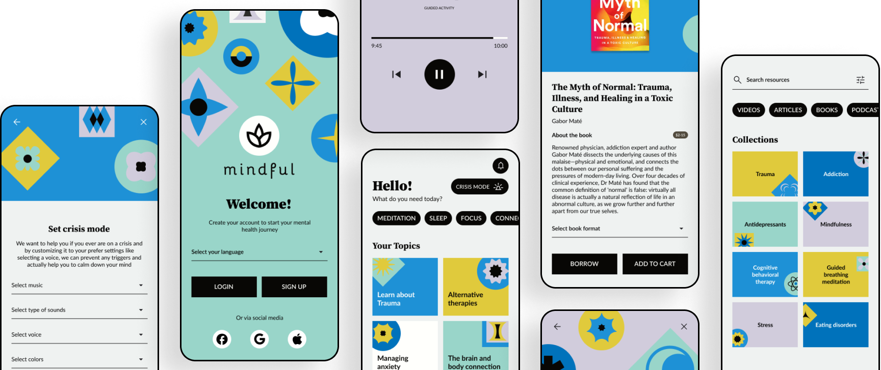
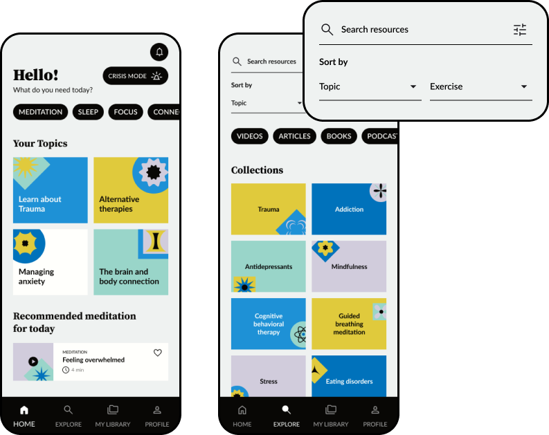
The information architecture of the app was simple, with four main categories, users can find the resources in either the home (based on the interest you choose on the onboarding), the explore section, where they can search for a specific topic or exercise and My library section, where they can continue with other resources they have previously saved or started (like courses, videos or books).
Wireframes
I created wireframes for the app to layout the main flows and to understand the most necessary functions. This helped in the first usability test for users to not be distracted by colors, typography, and imagery.
After the onboarding process, the user will be directed to the home, where it waits for them with topics based on their interest and the crisis mode.
One of the features of a “freemium” service it’s that most of the content it’s free and all of it has tags for you to know, and the paid content can either be bought or borrowed for example in the case of ebooks and audiobooks.
Usability studies
I conducted two usability studies. The findings of the first one guided the next steps for the mockups and high-fidelity prototype. The second usability study conducted on the high-fidelity prototype showed aspects that needed refining
Round 1 findings
A more realistic crisis mode exercise
Better cues to complete the crisis mode flow
Clearer signal that they can skip the accessibility adjustments
Round 2 findings
Better explanation to inform them what the crisis mode is
A better visual cue to know where is the crisis mode
A mobile-friendly flow to select the dates to borrow the books
Mockups
Customized experience
The app it’s designed for users to personalized their main topics, and crisis mode and to add all of the adjustments that they need to improve their journey
Easy search
The app was designed to provide easy searchability of the content. Either by the topics based on your preferences on the home or specific searches on the explore section
Crisis mode
The crisis mode, it’s personalized from the onboarding so that users can have a better experience if they ever need help to come out of an anxiety crisis
Buy or borrow resources
The app it’s a freemium experience with most of the resources free to access, some extra resources like courses and books can be bought or borrow
Continue your journey
On the library, users can find easy access to all the resources they have liked or saved for later, and continue with their courses, videos, and books
Accessibility considerations
1
Accessibility adjustments section from the beginning to users can adapt the app to their needs
2
A color palette both friendly with color blind people and neurodivergent people to not feel overwhelmed by the colors
3
Iconography to help users to navigate
High-fidelity prototype
In the high-fidelity prototype, the user can see the main flows, from the onboarding experience setting up the account to searching different resources based on topic and type of resource in the home or explore sections, the crisis mode exercise, and buying or borrowing resources.
Takeaways
Impact
Users loved the adjustments and how customizable everything was and how the brand and color palette was playful but not overwhelming
What I learned
The importance of prioritizing accessibility from the beginning of a project and the positive impact this has on usability for all users
"I really like how easy to use it is and how beautiful it looks, the colors, typography, everything"
Usability tester


